Color
TPCs main colors are deep blue, teal, black and gray. Poppy is used as a highlight color throughout the new taxpolicycenter.org web site.
When selecting colors for charts and graphs, we must first consider the type of data we are presenting. Usually, data can be grouped into one of two main groups: categorical or sequential.
Categorical palettes are best when you want to distinguish discrete chunks of data that do not have an inherent ordering.
Sequential color mapping is appropriate when data range from relatively low or uninteresting values to relatively high or interesting values. For sequential data, it’s better to use a palette that has a relatively subtle shift in hue accompanied by a large shift in brightness and saturation. This approach naturally draws the eye to the relatively important parts of the data. Sequential colors are used for sequential groups (not necessarily the way the data trends). So age groups young to old and date ranges might be something that I use sequential colors for.
For more information about the subtleties of color, refer to this collection of blog posts from Visual.ly.
The following color combinations are intended to take some of the guess work out of the process of assigning colors to charts. They're only examples, and can be mixed-and-matched depending on the story you are trying to tell with your data.
Color combinations
Main graphic colors
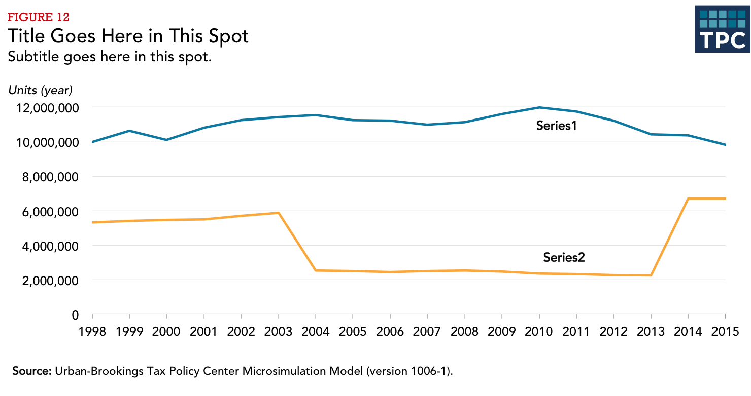
One group
Two groups
Categorical
Sequential
Three groups
Categorical
Sequential
Four groups
Categorical
Sequential
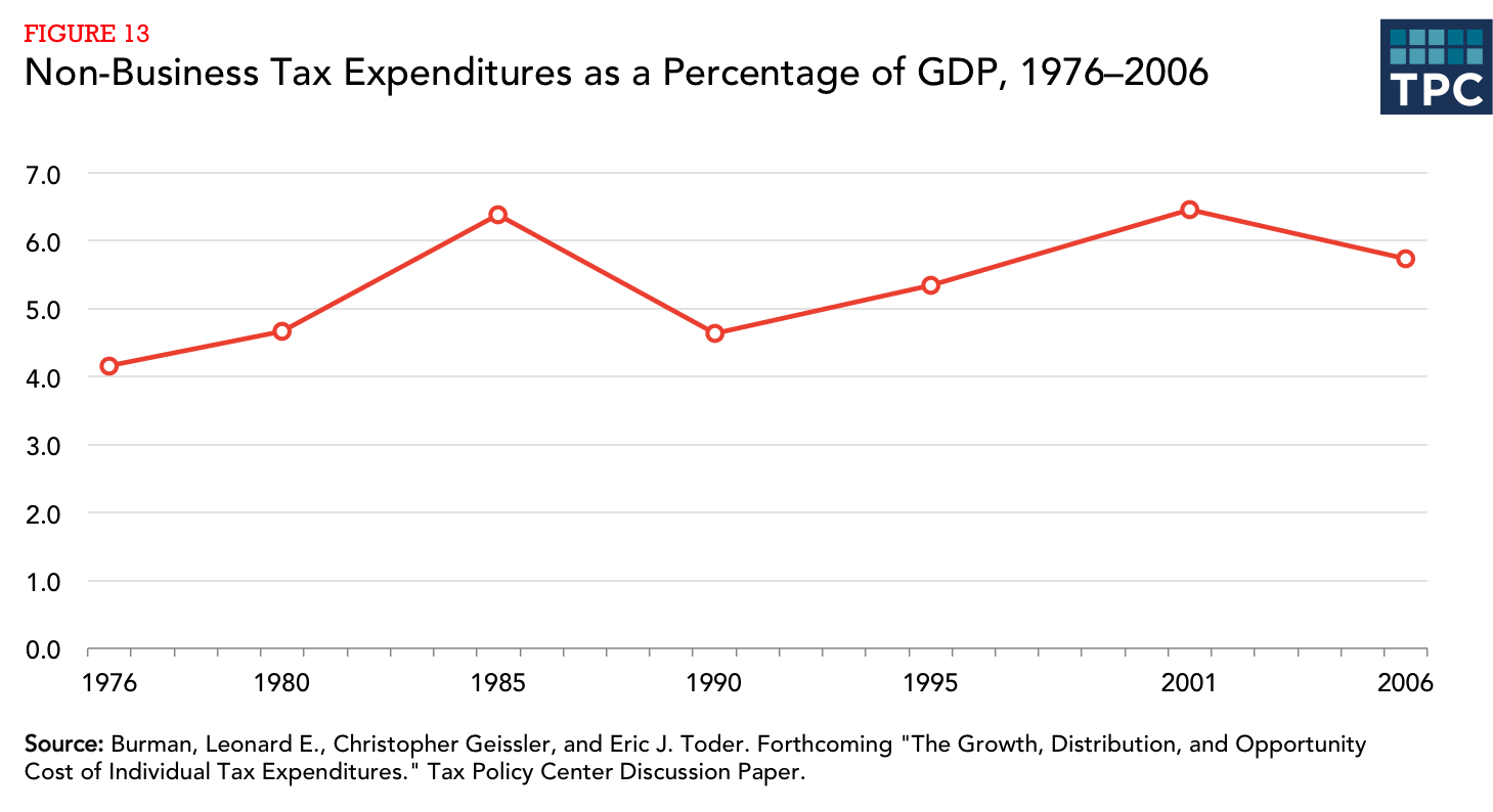
Five groups
Categorical
Sequential
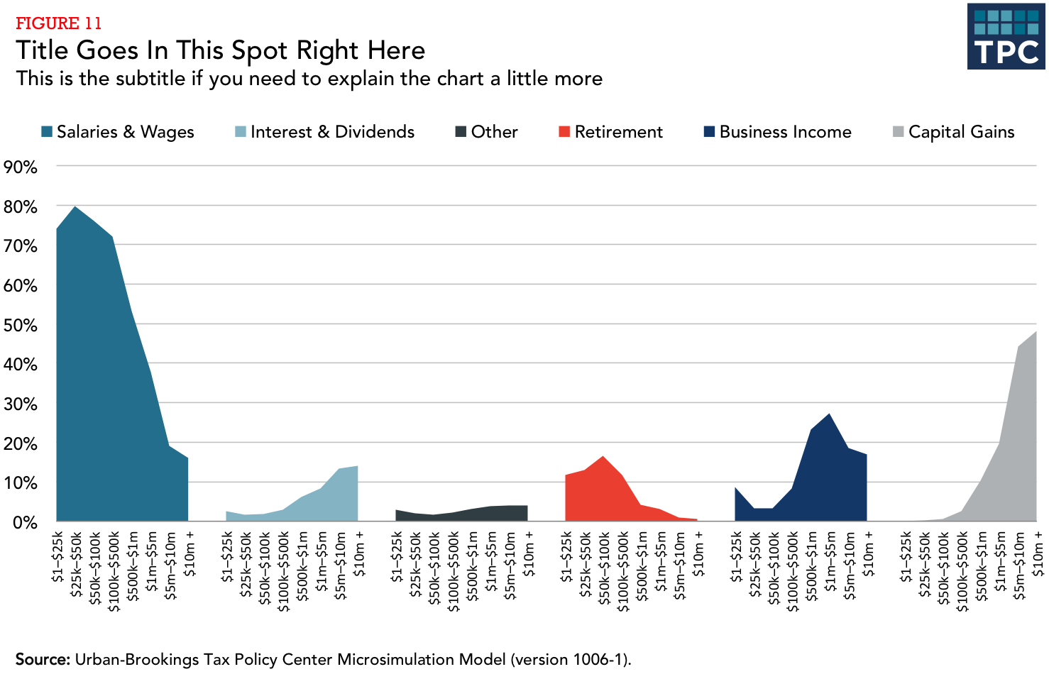
Six Groups
Categorical
Sequential
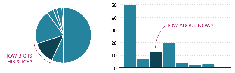
Seven Groups

Consider consolidating categories or breaking up the chart. Seven groups is really too many.